

We’re constantly being bombarded with facts, statistics, and graphs on news sites, blogs, and social media. How can we be a more skeptical thinker in the face of all this information?
It’s commonly said that the “information age” could just as easily be the “misinformation age.” Now more than ever it’s important we become skeptical thinkers.
While the internet allows us to have so much information readily available at our finger tips, it also allows anyone to share a misleading statistic (or a complete falsehood) which quickly becomes viral and spreads through tweets, status updates, blogposts, and online magazines.
We have to be super careful of the information we take in on a daily basis. Many times, just the presence of information can sway our beliefs and opinions before we get a chance to look at it critically or question it’s validity.
In one of the best selling statistics books How To Lie With Statistics, author Darrell Huff does a fantastic job walking you through how statistics are commonly manipulated and abused to support a certain viewpoint.
Of course very few people are statisticians. Most of us probably haven’t taken a statistics course since high school or college, if at all. However, it’s still important we learn the basics behind how statistics are often presented to us, because they make up such a big part of our day.
Every news article, commercial, and political speech is filled with numbers and statistics. And how we are presented with those statistics is going to influence what we think is true or not true – and thus the choices we make, whether it’s buying a product or voting for a candidate.
If done properly, statistics represent real facts. But it’s often the story told about a statistic (and what it accurately portrays) that can be muddled and misrepresented to push a certain agenda. We must be careful of how we look at statistics and what we take away from them.
This article will layout some basic considerations to keep in mind whenever you are presented with a statistic or fact.
Biased samples
Whenever you come across a statistic, the first question you should ask yourself is, “Where did this number come from?”
It’s easy to find any result you want if you have the right sample of people to measure. If a polling company only asks Republicans who they are voting for, then naturally you’re going to get a biased answer.
A good statistic has to reflect the sample it’s trying to measure. If you’re trying to find who is the most popular candidate in the United States, you need to make sure your sample includes a wide variety of people from the United States.
Often this means larger and more randomized samples are better than smaller and less randomized samples. A survey that only asks 10 people’s opinion in Oklahoma is likely not a sample that you can generalize to the rest of the United States.
A sample can also be biased depending on the methodology used to find participants. If a study only sends out mail-in surveys to companies to find out increases in profit size, it could have an inflated number since companies without much profits may not be willing to voluntarily reveal their low numbers.
If the method used to find a statistic excludes people who may skew the statistic in a different direction, then there’s a good chance the statistic may be misleading or inaccurate in some way.
Skeptical thinkers should always keep in mind the source behind a statistic (“Who was being measured?”) before jumping to any conclusions.
Well-chosen averages
When articles talk about an “average” it’s important to understand what they really mean. There are 3 types of averages that we can draw upon and each might paint a different picture behind what’s going on.
Often when people talk about “averages” they are referring to the mean (or “arithmetical average”), which is when you take the total score measured and divide it by the total amount of people.
But other forms of average include the mode, which is the number that occurs most frequently, and the median which is the number that separates the higher half of a sample from the lower half of a sample.
Here’s an illustration of each of these averages below:
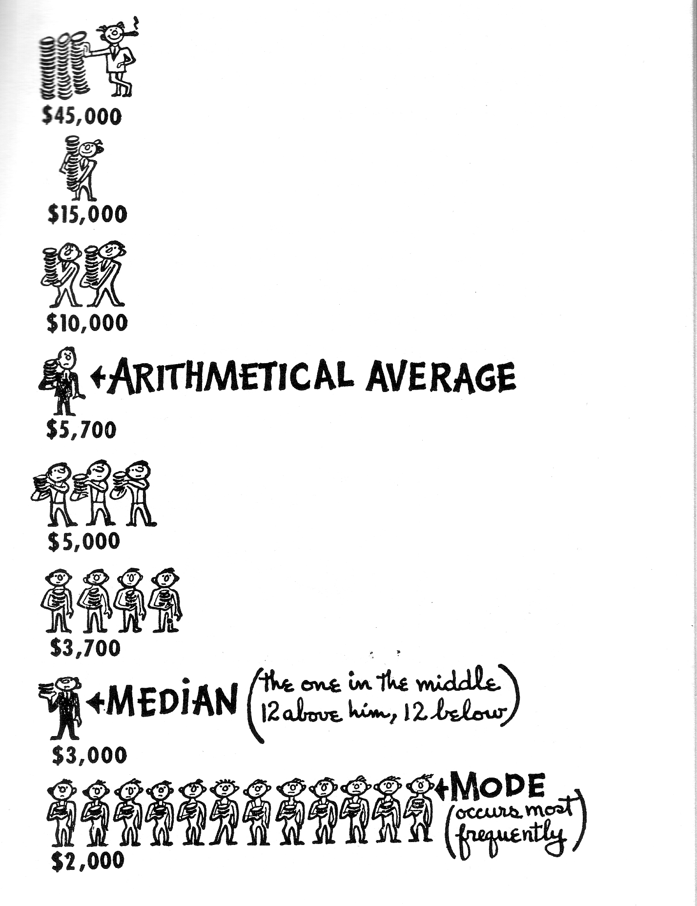
This illustration shows the average yearly salary of each employee in a fictional company (yes, it’s an out-dated example).
If a company wants to inflate the perceived yearly salary of the “average employee,” they might go with the mean at $5,700. But as you can see, the mode shows that most of the employees are only being paid $2,000.
In truth, there’s only a handful of people that are making above $5,000 in the picture. The top CEO, who is making $45,000, significantly alters the picture you’d expect if you didn’t see the information presented in this way.
Averages are compelling statistics because they give us a clean and simple number, but as a skeptical thinker you also have to pay attention to how the numbers are distributed, which often gives you a more complete picture of what’s going on.
Alluring correlations
One of the most popular sins when presenting statistics is to imply that correlation means causation.
Many studies and statistics reported today show a correlation between two things, but the media and news is quick to infer causation whenever these correlations come up.
For example, say a study finds there is a correlation between ice cream consumption and drownings in swimming pools. A reckless journalist might take this statistic and claim that “ice cream consumption causes drowning.” But of course this doesn’t make much sense.
Whenever there is a correlation, it’s possible that there’s a third factor that is influencing the relationship. In the above example, the third factor is summer weather which is typically associated with both increases in ice cream consumption and increases in swimming. That doesn’t mean ice cream and drownings have anything to do with each other.
Of course this example is a bit outrageous, but news reports and blogs often make the same errors, albeit they are often more subtle.
These types of stories often rely on our commonsense to seem true. A study finds that there is a correlation between fewer hours of sleep and depression. One might think “lack of sleep causes depression” – which seems to intuitively make sense – but it could just as easily be the case that the reverse is true: “depression causes lack of sleep.”
It’s easy to find correlations. A skeptical thinker knows it’s a lot harder to sift through the facts and determine causality. The world can be a complicated place with many factors happening simultaneously.
A skeptical thinker should be careful of what they infer whenever they come across a correlation – it may not be communicating what you think it is.
Misleading graphs and images
Look on any Twitter or Facebook feed and you’ll find plenty of graphs and images designed to illustrate a certain point. This is why it’s important to learn how to look at graphs properly and with a critical eye.
One common tactic that people use to prove a point is to cut off a graph at a certain point to make the change seem much more dramatic than it really is. This is why it’s crucial to always look at the x-axis and y-axis in any graph to make sure that the units haven’t been manipulated to make the graph look different.
Here’s one good example from the book:
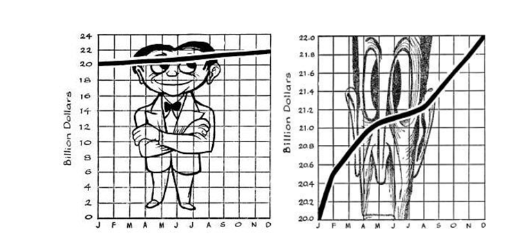
In the first graph, the y-axis starts at 0 which gives you a more accurate picture of the change in profits over the year. In the second graph, the y-axis starts at 20 which makes the change in profits seem far more radical than the first graph.
You can truncate any graph to make it look a certain way and make your point seem far more compelling.
Another thing to look out for on social media is graphs and statistics that don’t come with a source. It’s far-too-common for a Facebook page to share a graph or chart and never cite where the numbers come from, let alone if the source is credible.
Of course it’s not just graphs or charts that can be manipulated, but pictures too. We all know about how prevalent photoshop is to change an image in big and small ways (like making actresses on magazines look thinner and have perfect skin). This technique is also common for infamous “before” and “after” photos you find in commercials and advertisements.
A skeptical thinker should be careful when looking at graphs and not just take them at face-value. Make sure there is a source and make sure the graph hasn’t been manipulated or distorted in anyway to embellish a point.
The difference between statistics and stories
When people make an argument, they often cite a few statistics and then try to tell a story that fits these statistics.
This is an important difference to be aware of because often a statistic isn’t just presented by itself, but also with a particular narrative that attempts to explain the statistic in a certain framework.
A statistic done properly is an indisputable fact. But the story we tell about a statistic is subject to a lot of error and bias. Two people can look at the same set of facts and come up with very different narratives that try to explain those facts.
If there is one lesson you takeaway from this article, it’s to remember the difference between a statistic and a story. We need both to get closer to the truth, but the latter needs to be looked at with a very critical and skeptical eye.
If you want to learn more about being a skeptical thinker when it comes to facts and statistics then How To Lie With Statistics is a must-read book. It’s more relevant now than ever before. And don’t worry if you’re not that good at math, this is a perfect book for beginners and everyday people.
Enter your email to stay updated on new articles in self improvement: